Introduction
After formulating a coordinate system last week to create a
DTM of a miniature landscape we created in a planter box, we were given the
opportunity to do the field survey over again to improve our results. Our
methodology in the first week involved using lengths of twine pinned to the
side boards of the planter box for both the X and Y axis. The grid cells were
10cm x 10cm which resulted in a very coarse survey, missing important elevation
changes that resulted in a very imprecise model of the actual landscape. This lead to a very generic looking landscape that did not illustrate properly all of the elevation changes and generalized the landscape features. This
became evident when the data points were uploaded into ArcMap and various
interpolation methods were applied. More detail about the interpolation methods
will be talked about later on in the methodology section. For our second survey,
which occurred exactly a week later, we had a slightly warmer day to work in
and the landscape was relatively the same with the exception of an extra layer
of light snow which had fallen a few days earlier. In order to ensure the
landscape was more completely represented, it was decided that a 5cm x 5cm grid
system be implemented. After all, what good is a DTM if it does not represent
the landscape in detail?
Methodology
Once again, we had no advanced technology but rather we used our lengths of twine that had already
been cut to size and pinned them to the side boards on the planter box every
5cm along the X axis, parallel to the Y axis, resulting in lines of longitude. Instead
of running lines horizontally, we used a yardstick as a portable X axis to move
every 5cm and then take the data readings at the vertices. This method is
better depicted in Figure 1. This really sped up the process of collecting our
data points. We also sent one member of the crew to the computer lab set up
with an Excel spreadsheet to input the coordinate values in real time as we
were connected via Bluetooth. This saved a lot of time by not having to
manually write down every data point with pen and pencil as we had done the
first time out and then go enter them into the computer. The whole process took
around 2 hours from set up to take down. In the end, we had collected nearly
1000 data points! Communication was much improved and the process was a lot more streamlined this time around as our team had learned what needed to be improved from the week before.The points were then successfully uploaded into ArcMap and
then interpolation was run once again to see how improved the DTM was. The
interpolation methods used for this exercise are detailed below with a brief
description and the corresponding image. We were required to run 5
interpolation processes on the original data and then choose the best one for
the second data set.

Fig. 1 - New and quicker way for gathering data points at the vertices with a moveable 'X' axis.
Results
Below are the results of all the interpolation methods. Once again, sea level was the top of the planter box and we decided not to drop the sea level after we had collected all of our data but maybe should have to make it more realistic. All of the elevation units are in centimeters. The 3D maps were created in ArcScene and a base height multiplier of 0.75 was used to exaggerate the terrain a bit more to make it easier to interpret.
 |
| Fig. 2 - Data points after being uploaded into ArcMap |


Fig. 3 - The natural neighbor method is more of a locally based
interpolation method, that is, a central value is determined and then only a
small subset of values closest to the reference value are used and weighted to
determine the gap values. Natural neighbor does not introduce faux peaks,
valleys, or ridges that are not present in the data set. The surface passes
through the input samples resulting in a smooth surface everywhere except at
the locations of input data samples. This method resulted in a pretty accurate
model of the actual surface and is a lot smoother than the IDW output.


Fig. 4 Spline interpolation uses a mathematical formula which looks
to minimize overall curvature of the surface, resulting in a smooth looking
output. The surface passes exactly through the data points while picking up on
rapid changes in gradient or slope. I think that this method produced the most
accurate output of all the interpolation methods used. The surface is detailed
and smooth looking, picking up all of the elevation changes quite well. The river bed running along the western side of the box is quite detailed as well as the horseshoe shaped ridge line in the northeast.
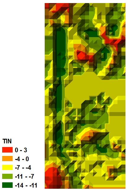
Fig. 5 - A TIN surface is a surface of triangular irregular networks
and is a way to show surface morphology in a digital format. Triangles are
constructed by triangulating a set of vertices. This method captures the
position of linear features such as ridgelines or streams. Overall, this method
is suited to showing better precision in areas where the surface changes while
there is lower resolution where little changes occur. *ArcScene kept crashing when the TIN was inputted, therefore there is no 3D oblique view of the TIN.


Fig. 6 - Inverse distance weighted (IDW) interpolation determines
cell values using a weighted distance combination of a set of sample points
derived from the data. The further away the point is from the sampled location,
the less influence that value has. This method is designed to be less smooth
and give the surface more detail. This method gave a pretty good rendition of
the actual plot. However, notice how unsmooth the surface. The resulting output looks very blotchy and just doesn't mesh together very well.


Fig. 7 - The kriging interpolation method generates a surface
estimated from a scattered set of points. Kriging takes into account spatial
autocorrelation and therefore is based on statistical analysis of all the
points and how they interact with each other. This method did not do a very
detailed job of creating a realistic surface but over generalized the plotted
area. It is clear that this method does not depict very well the changes in elevation or replicate the geographic features.
Conclusion
The team as a whole agreed that given a second swing at this project, we learned a great deal about teamwork, data collection, and data manipulation. During the first week we were sort of thrown in the fire right away and were pretty narrow minded. However, after being able to visualize our first data set, we knew right away that we could greatly improve our results. We also took it a bit more seriously the second time around and definitely wanted to build on what we had learned the first week. Having to use interpolation in the future is very likely so it was very beneficial gaining an understanding of how interpolation works and the different methods as well as their corresponding strengths and weaknesses. Not understanding this could lead to misinterpretation of data and unusable output maps.
No comments:
Post a Comment